Column
Description
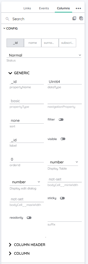
As the name already implies, this property treats any column related properties and can be found in the Detail Panel. It basically controls yTable columns and their individual properties, to make each column customizable.
| Feature | Value |
|---|---|
| Theme injectable | ✗ |
| Possible Inputs | A-Z, a-z, Any numeric value (integer or decimal), Special characters |
Column Ingredients
Field
This represents the actual designation of the column.
Type
As the name implies, this is the type of the column and indicates which values are stored.
Nullable
This controls, whether the column values can be null.
This depends on the type of the column. Only specific types can be nullable.
displayEditDialog
This property controls, how the value gets displayed inside the dialog. It can be set to:
checkbox number text date toggle textarea
E.g. you could display a boolean as a checkbox or a text.
displayTable
It controls how the values get visualized. It can be set to:
checkbox number text image link phone mail date time
E.g. you could display an image url as the url itself or as an image.
Sort
As the name implies, this controls how the records inside a column get sorted. You could build constructs like:
name asccreated, checkedIn desc
Filter
This controls if the column can be filtered individually by the user.
Label
This represents the actual label of the column which is printed inside the column header.
Name
This property represents the name of the certain column under which it can be found.
Visible
This controls, whether the column is displayed or not.
Sticky
Makes the column sticky, so that it does not disappear when scrolling and stays on top.
orderId
Controls the order of the columns in numeric order.
bodyCell minWidth
The minimum value for the width of the column. This can be set in:
px pt em vw vh %
bodyCell maxWidth
The maximum value for the width of the component. This can be set in:
px pt em vw vh % none
bodyCell fontAlignHorizontal
The font align of the text on the x-axis. This can be set in:
left center right
bodyCell fontAlignVertical
The font align of the text on the y-axis. This can be set in:
top middle bottom
bodyCell fontSize
The font size of the text. This can be set in:
cm mm in px em ex ch rem
bodyCell fontWeight
With the font weight of the text inside a column cell, you can choose how bold your font should be. Normally, font weight is set in steps of 100.
100 is very thin, 900 very thick. The normal font weight is 400.
bodyCell fontColor
The color of the text inside a cell of the column. This can be set as a color from a palette or a custom hex color.
bodyCell bgColor
This property controls the background color of the cells inside the column.
columnHeader fontAlignHorizontal
The font align of the text on the x-axis. This can be set in:
left center right
columnHeader fontAlignVertical
The font align of the text on the y-axis. This can be set in:
top middle bottom
columnHeader fontSize
The font size of the text. This can be set in:
cm mm in px em ex ch rem
columnHeader fontWeight
With the font weight of the text inside the column header, you can choose how bold your font should be. Normally, font weight is set in steps of 100.
100 is very thin, 900 very thick. The normal font weight is 400.
columnHeader fontColor
The color of the text inside the column header. This can be set as a color from a palette or a custom hex color.
columnHeader bgColor
This property controls the background color of the column itself and only colorizes the column header.
Occurences
Detail Panel
The properties of single columns can be adjusted inside the Detail Panel to individualize them.